A softer space.
Three fresh possibilities.
Inspired by your reference: luminous white, pearlescent color, sculptural voice visuals, and lighter controls. Three new interfaces—not variations of the first set.
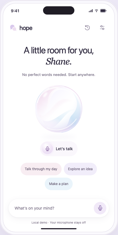
Opal
 New icon direction
A luminous home, a reflective pearl, and a personal welcome. The closest to your inspiration, with voice and text sharing one floating composer.
Try Opal ↗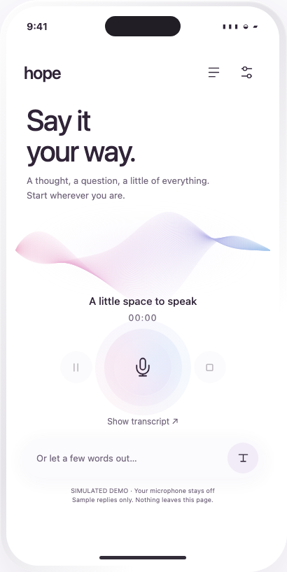
Ribbon
 New icon direction
A flowing pastel ribbon turns voice into a sculptural listening space. Focused, spacious, and designed around speaking rather than browsing.
Try Ribbon ↗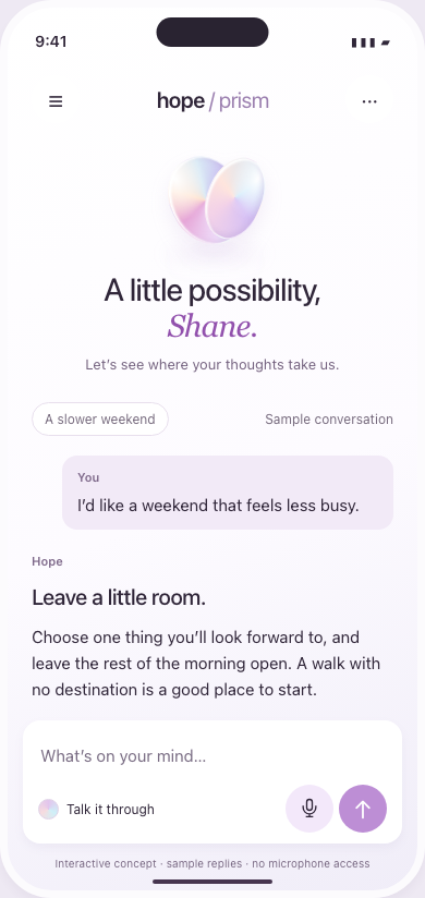
Prism
 New icon direction
A quiet conversation that unfolds into useful answers. A compact pearlescent identity, readable replies, and a floating voice-and-text composer.
Try Prism ↗It captures the reference’s personality most directly. Ribbon is the strongest voice-first option; Prism gives the most space to reading replies. Each demo includes a different replacement app icon, shown large and small.